


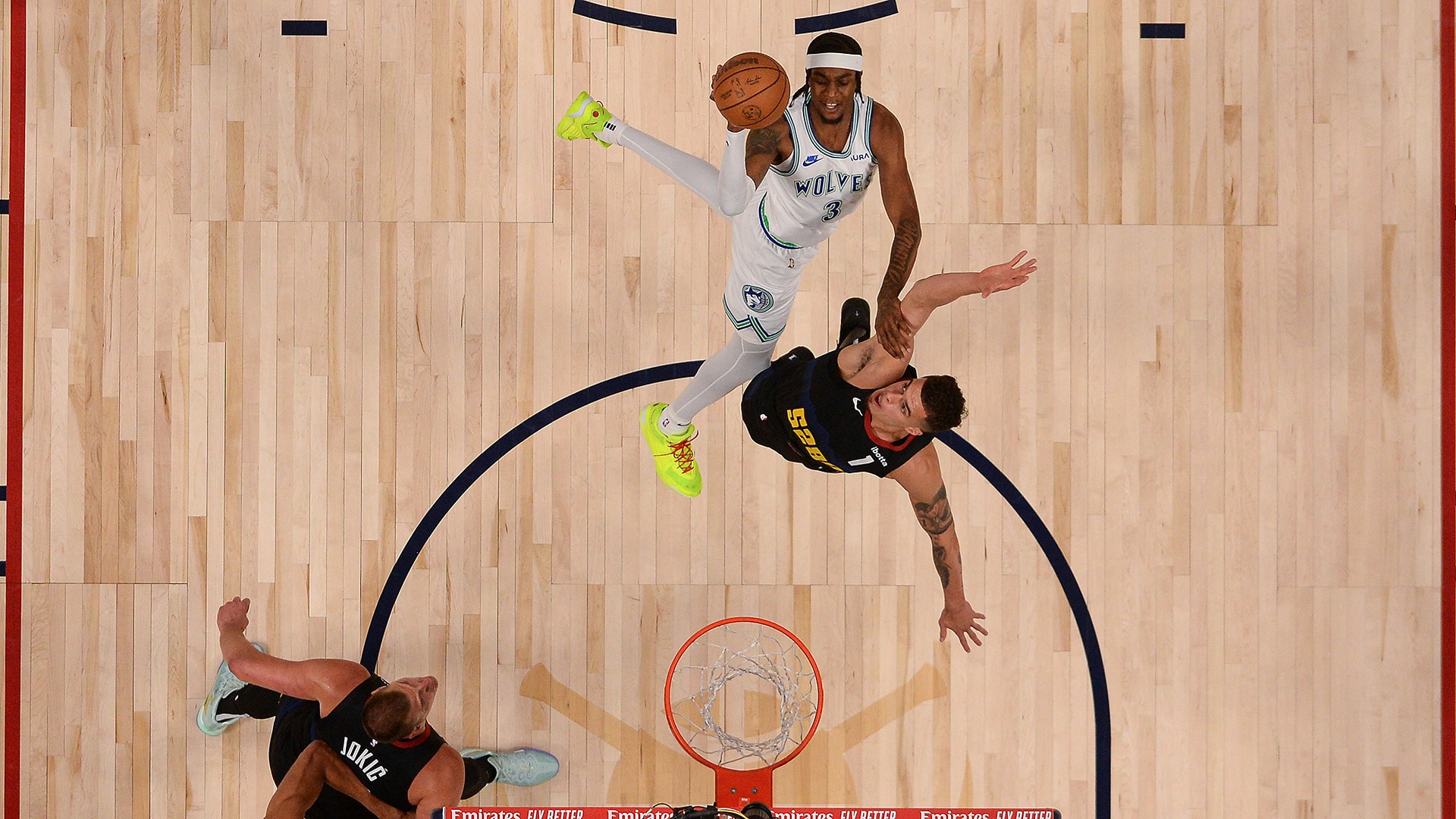


5 takeaways: Wolves rally, stun Nuggets in Game 7
After trailing big, Minnesota locks down and executes a 20-point Game 7 comeback to topple defending-champion Denver.
Inside the NBA: How Wolves made Game 7 history
The Timberwolves pull off the largest 2nd-half comeback in Game 7 history with a confident, collected total team effort.
Full Focus: Pacers' record shooting ousts Knicks
The Pacers set a record for best shooting performance in a playoff game as they defeat the Knicks and advance to the East Finals.
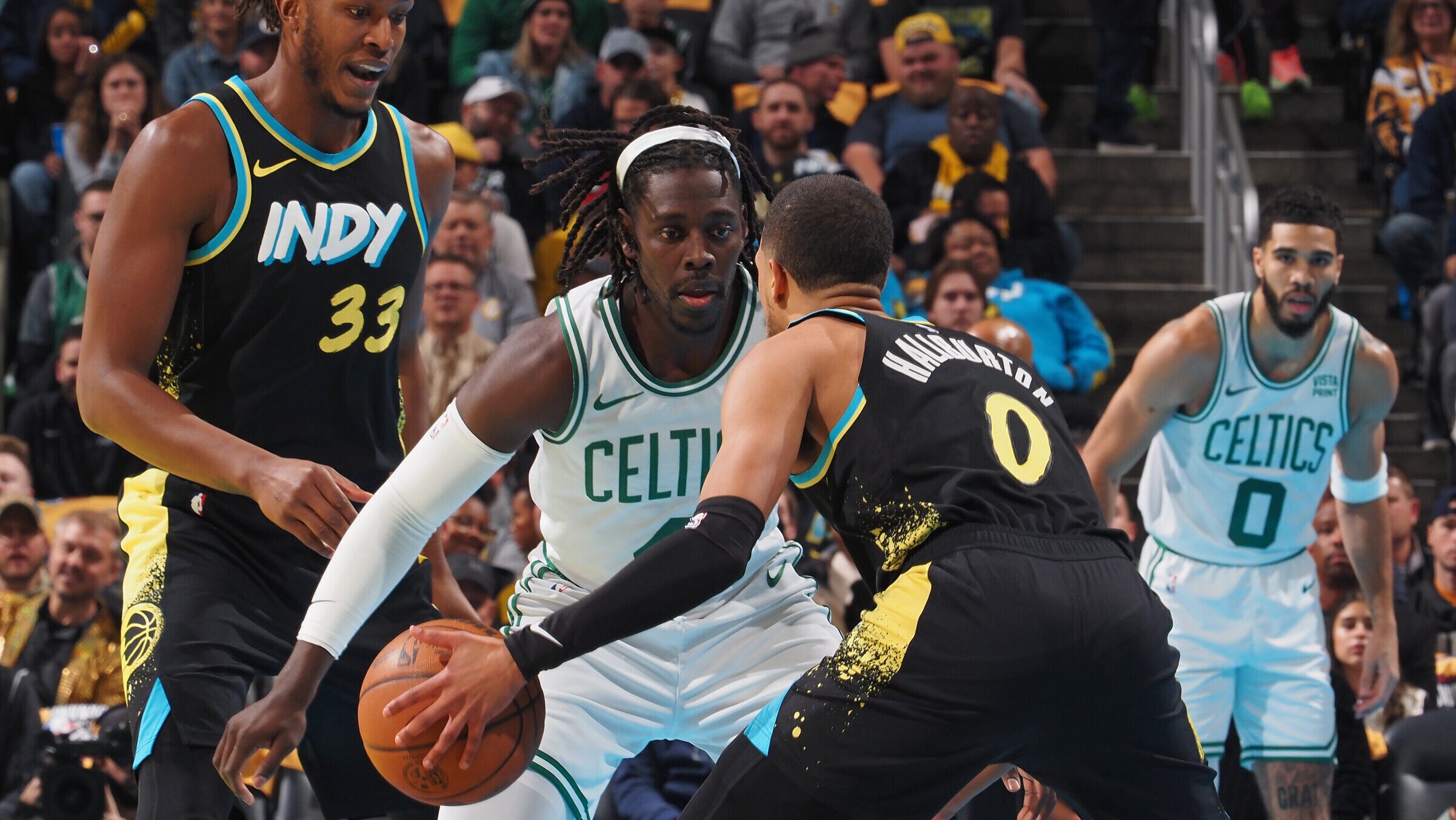
5 takeaways: How Pacers defied Game 7 convention
Tyrese Haliburton and the Pacers put on an offensive clinic, the Knicks break down and the Eastern Conference Finals are set.
Inside the NBA: Knicks' outlook bright despite exit
The Knicks are eliminated by the Pacers, but their future seems promising after cementing an identity under Tom Thibodeau.
Next: 5 takeaways: Wolves rally, stun Nuggets in Game 7
Next: Inside the NBA: How Wolves made Game 7 history
Next: Full Focus: Pacers' record shooting ousts Knicks
Next: 5 takeaways: How Pacers defied Game 7 convention
Next: Inside the NBA: Knicks' outlook bright despite exit
Stories
Headlines
- 2024 NBA playoffs: Schedule and results
- 5 takeaways: Wolves rally in historic fashion
- How Wolves mounted historic Game 7 comeback
- Edwards: 'We were poised for the entire game'
- 5 takeaways: Pacers sizzle, bounce Knicks
- Haliburton: 'All series we just found a way'
- Brunson leaves Game 7 with fractured hand
- East Finals preview: Haliburton, Tatum set to square off
- West Finals preview: All eyes on Doncic, Edwards
- On this date in 1995: Elie's 'Kiss of Death' 3 vs. Suns
- Every Gone Fishin' from 2024 NBA playoffs
2024 PLAYOFF SERIES
2024 PLAYOFFS
AROUND THE NBA


Headlines
- 2024 NBA playoffs: Schedule and results
- 5 takeaways: Wolves rally in historic fashion
- How Wolves mounted historic Game 7 comeback
- Edwards: 'We were poised for the entire game'
- 5 takeaways: Pacers sizzle, bounce Knicks
- Haliburton: 'All series we just found a way'
- Brunson leaves Game 7 with fractured hand
- East Finals preview: Haliburton, Tatum set to square off
- West Finals preview: All eyes on Doncic, Edwards
- On this date in 1995: Elie's 'Kiss of Death' 3 vs. Suns
- Every Gone Fishin' from 2024 NBA playoffs